Transform insights into action with content feedback loops from user data.
Ensure your analysis follows privacy law compliant tracking methods.
Surprising fact: companies that fix top page friction points using visual interaction tools report conversion lifts of up to 30% within weeks.
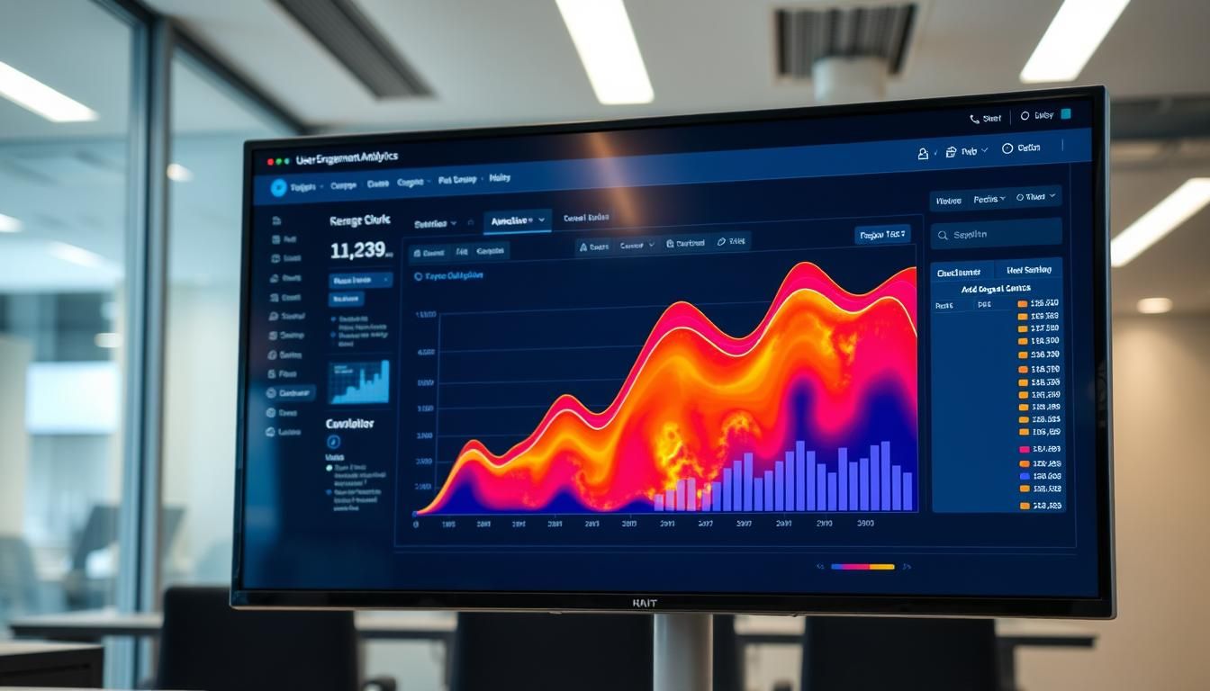
This guide shows a practical path to turn visual interaction signals into real insights and action that improve page performance. You will see how combined views of clicks, moves, and scrolls let teams spot high- and low-interest areas fast.
We focus on real user behavior across your website and key pages. The method helps prioritize which elements to test and which areas of the site need redesign.
Expect a step-by-step workflow: validate visibility with scroll and click maps, add move data to reveal distractions, then use an aggregated view to prioritize without context switching. Pair these findings with session replay and conversion analytics to turn insights into measurable action.
Outcome: a friendlier user experience, fewer drop-offs, and clearer priorities for product, UX, and marketing teams.
Key Takeaways
- Learn a clear method to convert visual interaction data into action.
- Prioritize elements and areas that drive ROI and reduce churn.
- Compare desktop and mobile behavior to ensure consistent experience.
- Use aggregated views to save time and align cross-functional teams.
- Pair page visuals with session replay and analytics to confirm intent.
What Heatmaps Reveal About User Behavior and Experience Today
Color overlays show where visitors click, tap, move, and scroll so teams can spot hot and cold spots fast.
Scroll maps reveal how far people reach and where false bottoms cause drop-offs. Click maps confirm if CTAs, links, and offers get real interaction.
Aggregated zoning views merge scrolls, clicks, and moves to highlight engaging sections without switching between map types.
Clusters of clicks or cursor movement point to interest, hesitation, or confusion. This helps prioritize content and layout fixes that support conversion.
Different users and visitor types behave differently across pages and devices. Sample multiple templates and entry points before generalizing findings.
!heatmaps
| Map type | Main signal | When to use |
|---|---|---|
| Click maps | Where users tap or click | Validate CTAs, navigation, and unexpected click targets |
| Scroll maps | Depth and average fold | Check if important content sits above the fold or hits false bottoms |
| Move/zone overlays | Cursor pauses and attention | Spot hesitation, distraction, and areas to test for conversion |
- Visibility shapes outcomes: if key content is below the average fold, fewer visitors will take action.
- Context matters: interaction is useful only when it supports the intended user journey and product goals.
Types of Heatmaps and When to Use Each
Each map type shines light on a unique part of user behavior and page performance.
Click maps and tap maps: validating CTAs and navigation
Click maps show where visitors tap or press. Use them to confirm CTAs and find misleading non-clickable elements.
They help you decide where to move buttons or add links to improve conversions on a page.
Scroll maps: fold, depth, and false bottoms
Scroll maps reveal how far people go and where sharp drop-offs happen.
Spotting a false bottom can save missed content and lift conversions by moving key product or offer information higher on the site.
Mouse-tracking and eye-tracking: attention versus interaction
Mouse-tracking shows cursor clusters that often signal hesitation or confusion. Combine this with click data to confirm real interaction.
Eye-tracking gives precise visual attention but is costly and best for small sample studies.
Rage, error, and dead click maps: spotting friction fast
Rage clicks flag repeated taps on unresponsive elements. Error clicks point to client-side failures. Dead clicks reveal items that look interactive but are not.
“Fixing a single error click source can remove a major conversion blocker overnight.”
- Use an AI type heatmap as a directional tool when traffic is low.
- Capture several map types for the same page to build reliable data and prioritize fixes.
Set Up for Success: Tools, Pages to Analyze, and Device Coverage
Start by picking tools that give you click, move, and scroll maps plus a zoning layer to combine signals at a glance. A single platform that merges these map types saves time and reduces errors when teams review the same page.
Choose a tool that supports core map types and zoning so you can aggregate clicks, moves, and scrolls without juggling multiple screens. Confirm tracking integrity first so the data reflects real users and not bot traffic or dynamic-script artifacts.
Select high-impact pages across your funnel: homepage, category and product pages, pricing, cart/checkout, and lead-capture forms. These pages drive measurable outcomes and show where changes will move the needle.
Compare desktop and mobile views. Look at how much content sits above the fold on each device and whether key elements are buried. If interaction patterns differ, plan layout or content changes to restore parity.
!tools map types
- Document tool settings and naming conventions so stakeholders find the right snapshots for each page, device, and period.
- Create a baseline library of maps for the same pages across devices to measure change after design updates.
- Pair page-level maps with analytics and session replay to link areas of interest to conversions and confusing behaviors — see this guide for deeper steps: types heatmaps and how to analyze.
How to Run Heatmap Engagement Analyses Step by Step
Run a focused walkthrough of your page signals so teams can spot visibility gaps and immediate fixes.
Confirm visibility with scroll maps and average fold. Use a scroll map to locate the average fold and check the percentage of visitors who reach each section of the page. Sharp color shifts can mark false bottoms where users stop scrolling.
!scroll maps
Validate interaction on key elements with click maps
Next, review click maps to see if primary CTAs, buttons, and links get real interaction. Look for unexpected hotspots—areas that draw clicks but are not interactive.
Identify distractions and confusion via move maps
Move maps show where cursor activity clusters without clicks. These swirl patterns often signal hesitation or unclear wording.
Compare behavior across devices to guide responsive design
Compare desktop and mobile maps to spot mismatches. If a CTA is above the fold on desktop but buried on mobile, prioritize a responsive change.
- Capture “before” snapshots so you can measure after changes.
- Pair map findings with a session replay example to confirm intent or frustration.
- Summarize insights into specific design actions to improve the user experience.
“Use maps to tie visibility, interaction, and distraction to clear next steps for the website.”
Combine Insights with Engagement Zones and Zoning
A single zoning view turns scattered map layers into one actionable snapshot of user attention. This method groups clicks, moves, and scrolls into color-coded zones so teams can see which areas and elements on a page overperform or underperform in seconds.
Aggregate signals to prioritize work. When zones show a high-traffic button but low conversions, that element becomes a clear test candidate. Tie zone data to conversions and revenue to justify design changes and calculate ROI by element.
How to use zoning in practice
- Combine key data in one view to avoid switching between maps and speed decision making.
- Prioritize elements by relative user interaction and potential conversion impact, moving low-value content down or out.
- Share snapshots of zones with stakeholders to align design decisions and cut subjective debate.
- Validate with session replay when clicks cluster but conversions lag, so you can separate positive interaction from friction.
Document both the data and the insights in a shared space and compare before-and-after zone snapshots to confirm change. For a deeper how-to on these views, see the Engagement Zones guide.
Troubleshoot Friction: Rage Clicks, Errors, and Misleading Elements
Spot rapid, repeated clicks to find the exact moments when visitors hit a wall on your site. These signals reveal where a page blocks action, confuses users, or throws a bug.
Use session replay to validate what maps suggest. Watch the user before and after the moment of frustration to see if rage stems from confusion, a bug, or a missing affordance. This context makes remediation precise and fast.
Use Session Replay to validate rage clicks and drop-offs
Play short sessions that show the repeated click and the steps around it. Note timing, device, and page state so engineers can reproduce the issue.
Fix dead and error clicks to reduce churn and improve usability
Clarify which elements are interactive. Add visual cues like underlines or hover states, or make the commonly clicked item truly clickable.
- Prioritize fixes by number of affected visitors and how close the element sits to conversion points.
- Log error clicks with console traces and timestamps so engineers can act quickly.
- Document one clear example per fix to show impact and gain stakeholder buy-in.
- After changes, re-check your heatmaps to confirm rage and error signals fall and intended interactions rise.
| Signal | Common cause | Quick action |
|---|---|---|
| Rage clicks | Unresponsive buttons or disabled states | Restore feedback, enable or hide inactive controls |
| Dead clicks | Non-interactive elements that look clickable | Add affordances or convert to links/buttons |
| Error clicks | Client-side failures or JS errors | Capture console logs and escalate with repro steps |
| Drop-offs after clicks | Confusing flows or missing next steps | Simplify flow and add clear CTAs near the element |
“Fixing misleading elements quickly reduces churn and makes the site more usable.”
For a focused walkthrough on mapping rage patterns, see the rage click maps guide. Share concise insights and next actions with product, design, and engineering to keep the feedback loop tight and turn findings into measurable action.
From Insights to Action: Optimizing Layout, Content, and CTAs
Small layout shifts, guided by user signals, often create large uplifts in conversions. Use zoning and traditional maps to see if high-value CTAs get clicks or sit below the fold. When visitors miss an element, move it into the initial viewport and measure results.
Surface high-value elements above the fold to lift conversions
Surface high-value elements above the fold
Elevate primary CTAs and critical elements into the first screen when maps show low scroll depth. This reduces friction and gives most users a clear next step.
Reorder or remove low-engagement sections
Use move and scroll signals to find distracting or unused areas. Reorder, condense, or remove those sections to improve clarity and focus on conversion goals.
Practical steps
- Adjust microcopy and visual hierarchy so CTAs compete less with secondary content.
- Separate multiple goals with spacing and hierarchy to reduce choice paralysis.
- Reposition product proof points near CTAs if click maps show interest lower on the page.
| Action | Signal to use | Expected outcome |
|---|---|---|
| Move CTA above fold | Scroll map / zones | Higher visibility, more clicks |
| Remove low-value section | Move & scroll low activity | Cleaner page, faster decisions |
| Make dead elements interactive | Click clusters on non-links | Reduce confusion, increase conversions |
“Validate every change with new heatmaps and share a short changelog linking each change to the insight that drove it.”
Measure Impact: Connect Engagement to Conversions and Revenue
Linking on-page interaction to actual sales turns visual signals into business results fast. Start by defining which conversions matter for your product and site, then map the metrics you will use to prove impact.
Before-and-after comparisons to quantify lift
Capture before-and-after heatmap and zoning snapshots for the same page and device. This shows if visibility and interaction improved where you made changes.
- Pair maps with analytics to attribute conversion lift to specific areas and elements.
- Build an ROI model per element or zone by linking observed changes to downstream conversions.
- Share one clear example where moving a CTA or simplifying a section raised completion rates.
Journey analysis to find bottlenecks and winning paths
Use journey analysis to trace how visitors move across pages and where users drop off. Target tests at the bottlenecks that limit conversions and prioritize fixes by potential revenue impact.
- Track differences by audience segments and devices to ensure gains scale beyond a subset of users.
- Create a recurring review cadence to compare key maps, journey metrics, and analytics.
- Document learnings in a living playbook so product and content teams reuse what works.
“Tie visual snapshots to conversion and revenue so every change has a clear business case.”
Conclusion
Close the loop by turning visual signals into prioritized experiments and measurable wins. Use heatmaps and maps to validate visibility and to spot where users stop, click, or hesitate.
Combine click maps and scroll maps to check fold, scroll depth, and interaction. Add move data to reveal distractions and guide layout or content changes.
Troubleshoot with rage clicks, dead clicks, and session replay so fixes reduce friction and improve usability. Small layout shifts often lift conversion fast.
Test across the website and devices, track the percentage of visitors who reach key elements, and document snapshots. Keep a lightweight playbook of repeatable patterns so teams scale what works.
Keep learning from user behavior and turn each insight into action that makes pages easier for customers to use.
FAQ
What do visual maps reveal about how visitors use my pages?
Visual maps show where people click, tap, and scroll, revealing which elements attract attention and which go unnoticed. They help you spot strong CTAs, content that holds interest, and areas causing confusion so you can improve layout and copy to boost conversions.
Which map type should I use to validate my calls-to-action and navigation?
Use click and tap maps to confirm CTA placement and navigation performance. These maps show actual interaction points from desktop and mobile visitors, so you can test button size, wording, and link clarity to increase clicks and reduce friction.
How do scroll maps help me understand the average fold and content depth?
Scroll maps reveal how far visitors scroll and where drop-offs happen. They identify the average fold, false bottoms where engagement stops, and whether important content or CTAs are being missed. Use this to reposition key elements higher on the page.
When should I use mouse-tracking or eye-tracking vs. interaction maps?
Mouse-tracking and eye-tracking show attention patterns, while click and tap maps show direct interaction. Use attention data to understand visual focus and move maps to find distractions; use interaction maps to validate behavior and measure conversions.
What do rage, error, and dead click maps tell me about usability problems?
These maps highlight frustration signals—repeated clicks, clicks on non-interactive elements, or clicks that trigger errors. They point to confusing design, broken links, or misleading affordances so you can fix issues that cause abandonment.
How do I choose the right tool and pages to analyze?
Pick a tool that offers multiple map types, session replay, filtering, and device segmentation. Start with high-impact pages across the funnel—home, product, pricing, and checkout—and focus on pages with traffic and conversion potential.
How do I ensure comparable insights across desktop and mobile?
Analyze device-specific maps and compare layouts side by side. Segment data by device, resolution, and orientation. Pay attention to tap targets, vertical scrolling, and content order to optimize for each experience.
What step-by-step approach yields reliable behavior insights?
Confirm visibility with scroll maps, then validate interactions with click maps. Use move maps and session replay to diagnose confusion, and compare devices to spot responsive issues. Prioritize fixes that impact conversion and user flow.
How can I combine different maps into engagement zones for better prioritization?
Aggregate clicks, moves, and scrolls into zones that reflect attention and interaction. Rank zones by engagement and revenue impact, then target high-value areas for design and copy updates to maximize ROI.
How do session replays help when I see rage clicks or sudden drop-offs?
Session replay lets you watch exact visitor interactions to confirm whether clicks were accidental, caused by broken elements, or triggered by confusing design. Use replays to reproduce errors and prioritize fixes that reduce churn.
What quick fixes reduce friction from dead and error clicks?
Make non-interactive elements clearly static, fix broken links and scripts, enlarge tap targets, and add clear labels for buttons. These changes reduce frustration and improve completion rates across devices.
How can I use insights to improve layout, content, and CTAs?
Move high-value elements above the fold, simplify page sections that get low interaction, and A/B test CTA text, color, and placement. Use audience data to tailor messaging and guide users toward conversion paths.
How do I measure whether changes actually boost conversions and revenue?
Run before-and-after comparisons with the same traffic segments and track key metrics: click-through rate, form completions, checkout conversions, and revenue per visitor. Combine map data with analytics to quantify lift and validate wins.
What common mistakes should I avoid when interpreting map data?
Avoid overgeneralizing from small samples, ignoring device splits, and attributing causation without A/B tests. Also don’t fix design based solely on attention patterns—combine interaction metrics and replay to guide decisions.