Did you know that focused pages can lift conversion by double or more compared with a general website homepage?
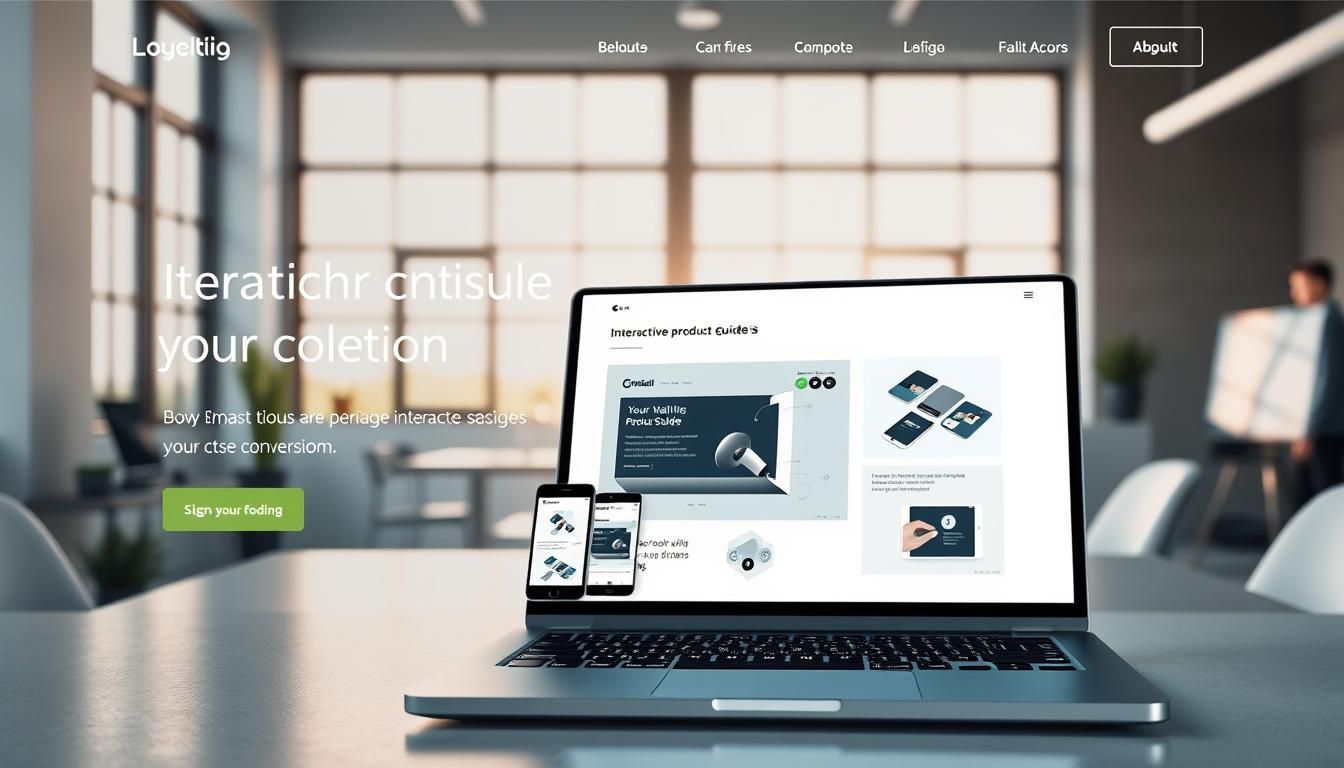
A landing page is a standalone page built to get one clear result. It removes distractions and asks visitors to take a single action, like filling a form or starting a trial.
When navigation is minimized and every section points to the same goal, more people finish the intended task. That clarity also yields cleaner analytics and better ad performance, which can lower CPCs for your company.
Well show a practical blueprint to plan, design, and optimize a page that turns attention into leads. Expect tips on trust builders, testing headlines and CTAs, and quick wins you can implement today.
Key Takeaways
- Single-CTA pages focus visitors and improve conversions.
- Removing navigation reduces friction and boosts completion.
- Clear value and social proof help build trust fast.
- Targeted pages give cleaner analytics for smarter tests.
- Better ad relevance often lowers CPC and raises quality scores.
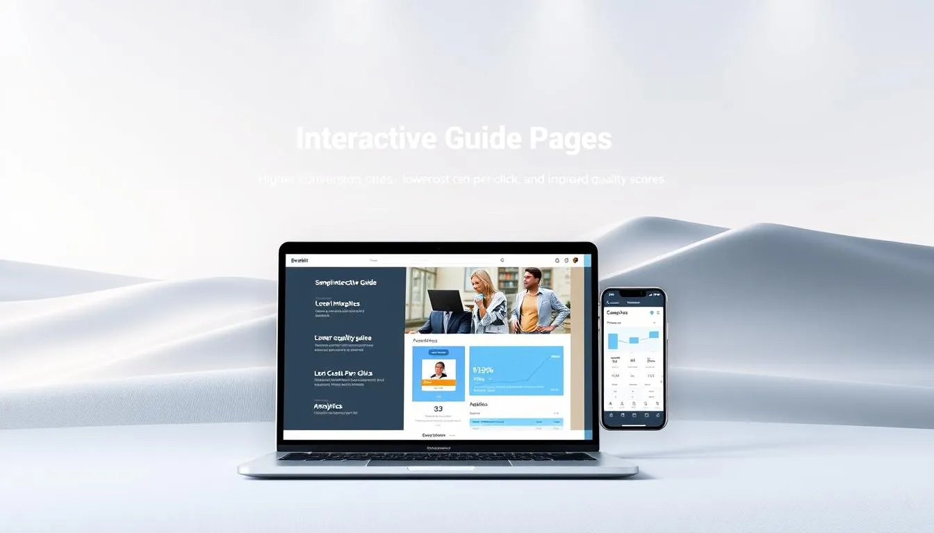
What are interactive guide landing pages and why they convert today
Adding user-driven elements to a page helps people move from curiosity to action. A modern landing page is single-purpose: it focuses on one goal and uses motion, calculators, quizzes, or micro-tasks to steer visitors toward that goal.
These features hold attention longer and make complex offers easier to grasp. Marketers report clear wins: 81% say interactivity helps them stand out, and 93% of B2B teams see higher conversion with dynamic content. Real examples back this upFedEx grew revenue 82% month-over-month after adding a shipping calculator; BloomReach hit 70% conversion with a quiz.
Good interactive design reduces cognitive load by letting people explore at their own pace. Tools like calculators or short quizzes personalize the path without forcing long reading or bulky forms.
- Keep the experience lightweightstart with small motions that support the CTA.
- Match the ad promise to the page experience to avoid drop-off.
- Ensure every element nudges visitors toward a single action and measurable leads.
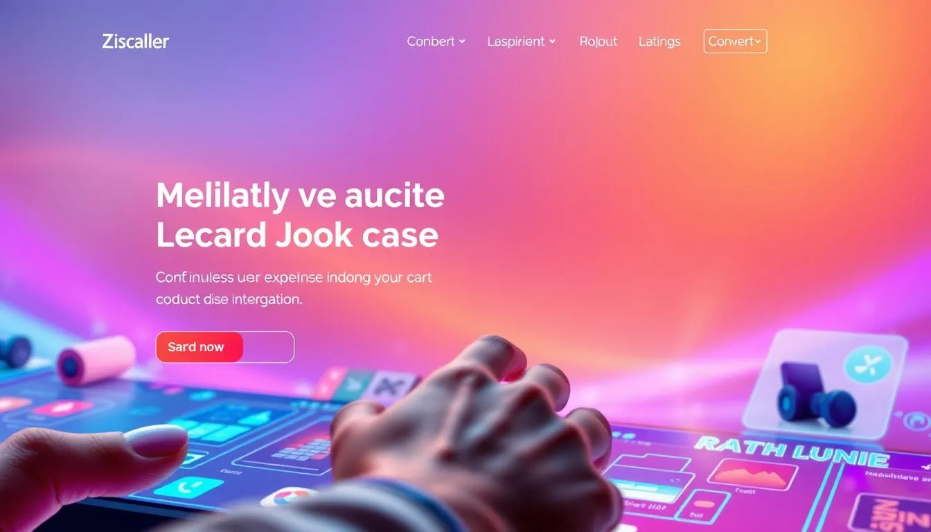
Single-focus design: the core principle behind higher conversion rates
A single clear goal on a page turns curiosity into quick decisions. Keep the path from click to completion short. That means removing links and choices that pull attention away from the main CTA.
Attention ratio is simple: one page, one action. When you limit off-ramps, more visitors reach the form or checkout. Remove global navigation, footer links, and unrelated CTAs.
Attention ratio and removing navigation distractions
Put the first CTA above the fold and repeat it with the same wording through the page. Consistent language reduces friction and tells the customer exactly what to do next.
Aligning copy, hero, and CTA to one goal
Match headline, subhead, and hero media so they promise what the ad delivered. Tight copy leads with value, then gives details. Clear, aligned elements help a visitor understand the offer in seconds.
- One clear CTA per page
- Same CTA text above the fold and in long-form sections
- Hero media that supports the single goal
- Remove unrelated links and competing buttons
| Design Focus | What to Remove | What to Keep | Impact |
|---|---|---|---|
| Navigation | Global menu, extra links | Primary CTA, minimal footer | Higher conversion rate, less bounce |
| Copy | Long tangents, vague claims | Value-first headline, short details | Faster comprehension, more form completions |
| Media | Distracting images, unrelated video | Hero image/video that backs the offer | Stronger attention and trust |
The benefits: from engagement to lower CPC and better quality scores
Tailored messaging on a focused page turns search intent into measurable results. When headline keywords match ad copy, Google sees higher relevance and rewards the ad with a better Quality Score.
Better Quality Scores often reduce CPC and increase impression share in paid search. That means more visibility for the same budget and lower cost per lead.
Targeted messaging for specific audiences and goals
Targeted landing pages speak directly to an audience’s pain points and use cases. This reduces bounce and improves time on page.
Ask only for essential fields on the form to lift lead quality. Fewer fields tied to nurture and routing yield higher completion and better follow-up data.
- Ad-to-page congruence: matching keywords to headlines boosts relevance and lowers CPC.
- Segmentation: pages let you A/B test content and capture funnel-ready leads.
- Proof: use segment-specific testimonials to increase trust quickly.
- CTAs by intent: offer downloads for awareness, trials or demos for bottom-funnel visitors.
| Benefit | What it affects | Outcome |
|---|---|---|
| Keyword-aligned headlines | Quality Score | Lower CPC, better ad rank |
| Single-goal funnels | Analytics clarity | Faster optimization cycles |
| Minimal form fields | Lead quality | Higher conversion probability |
“Structured testing on targeted pages compounds gains over timesmall lifts become durable performance wins.”
Types of landing pages you can turn interactive
Different page formats let marketers tailor how visitors discover value and take action.
Squeeze pages use a short form and a clear offer to grow lists at the top of the funnel. Keep the headline tight, the copy benefit-led, and ask only for an email or name. Multi-step forms or a tiny quiz can lift completion without adding friction.
Squeeze and lead capture pages
Lead capture pages go deeper. Add fields like role or company size to qualify inbound demand. Use conditional fields or progressive profiling so the form feels shorter to first-time visitors.
Click-through and long-form pages
Click-through pages educate first, then send visitors to a free trial or checkout. Long-form pages act as a detailed sales pitch. They include benefits, proof, FAQs, and repeat CTAs to address objections and guide action.
Video-first pages for product and SaaS
Video-first pages place a demo above the fold to explain a product service in minutes. Videos boost retention and help customers grasp complex value quickly. Add chaptered players or short interactive overlays to keep attention and track engagement.
| Type | Primary goal | Best interactivity | When to use |
|---|---|---|---|
| Squeeze page | Grow email list | Short form, pop-up quiz | Top-of-funnel offers |
| Lead capture | Qualify prospects | Multi-step form, conditional fields | Demand generation |
| Click-through / Long-form | Educate then convert | Expandable sections, calculators | Complex products or high-consideration buys |
| Video-first | Demo & explain value | Chaptered video, overlays | Product demos, SaaS trials |
Practical tip: mix formatsa long-form page with an embedded explainer or an image comparison slider can help show service benefits and still keep every interaction pointing to one clear CTA. For more examples and setup ideas, see interactive landing pages.
Essential elements and page structure that build trust and drive action
Trust forms the backbone of any high-converting page; every element should prove you deserve it.
Start with a crisp USP that states the unique benefit in one line. Follow with a strong headline that mirrors your ad or email. Short supporting copy should answer the key question: what do I get and why does it matter?
Choose a hero image or video that shows the product or service outcome. Place a single, specific CTA near the hero and repeat the same CTA text later to reduce friction.
Form strategy and lead flow
Keep the form short. Ask only for essential fields needed to route and follow up. Use conditional questions when you need qualification without scaring away visitors.
Social proof, privacy, and follow-up
Add named customers, logos, and short quantified outcomes to build trust fast. Include a clear privacy notice near the form to reduce hesitation.
Finally, use the thank-you page to deliver the asset and suggest a logical next stepan upsell, trial link, or social followso leads keep moving down your funnel.
| Element | What it does | Best practice | Impact |
|---|---|---|---|
| USP & Headline | State value immediately | Match ad promise; one-line USP | Faster clarity, higher conversions |
| Hero image / video | Show outcome or product | Use contextual media that supports text | Stronger engagement and trust |
| CTA & Form | Drive the intended action | Single descriptive CTA; minimal fields | Lower friction; better lead quality |
| Social proof & Privacy | Reduce doubt and compliance risk | Named testimonials, logos, short notice | Improved conversions and trust |
Interactive techniques that boost engagement and conversions
Small, well-placed motions and tools can pull a visitor’s eye from curiosity to the CTA in seconds. Use these techniques to make a landing page feel alive without distracting visitors from the main action.
Animations, micro-interactions, and 3D elements
Subtle motion guides attention. Use hover-triggered animations to highlight primary buttons. Add micro-interactions for feedback on clicks and form progress.
Consider lightweight 3D visuals to demonstrate features. They make a product more memorable and boost conversion rates when used sparingly.
Explainer videos and interactive demos
Place a short explainer video above the fold to clarify complex offers fast. Video helps visitors grasp benefits and reduces doubts.
Combine a demo that lets a user try core features before signup. This often converts better than static screenshots.
Quizzes, calculators, and multi-step forms
Quizzes route visitors to the right content and personalize next steps. Calculators show value in real timeFedExs calculator is a classic ROI example.
Split long forms into multi-step flows to lower drop-off and increase form completions.
Image comparison sliders and surveys
Use an image slider to show before/after proof. It makes benefits tangible and speeds decisions.
Short surveys capture visitor feedback and feed improvements that raise conversion rates over time.
- Use subtle motion to guide eyes to primary buttons.
- Add micro-interactions for hover and progress feedback.
- Offer short demos or video to reduce friction and explain value.
- Quantify value with calculators and split forms to reduce intimidation.
User experience that keeps visitors moving: speed, responsiveness, accessibility
Performance and clarity are the twin engines of a high-converting page. A site that loads in one second converts roughly three times more than one that takes five. Optimize images, compress media, and defer non-critical scripts to cut load time.
Test regularly with tools like PageSpeed Insights and fix the largest offenders first. Design mobile-first so key content and the CTA appear immediately on small screens.
Page load speed and mobile responsiveness
Prioritize speed: compress images, use lazy loading, and minimize third-party scripts. Make touch targets large and forms simple so visitors can complete the action on phones without friction.
Accessible design: contrast, alt text, and screen readers
Use semantic markup and clear alt text for all images so screen readers convey the right information. Meet contrast guidelines and choose readable fonts to help all users scan text quickly.
- Prioritize speed and test performance often.
- Design mobile-first and keep forms short for easy completion.
- Provide captions for video and respect reduced-motion preferences.
- Ensure keyboard navigation, focus states, and screen reader compatibility.
| Focus Area | Action | Benefit |
|---|---|---|
| Page speed | Compress images, defer scripts, use CDN | Lower bounce, higher conversions |
| Mobile UX | Mobile-first layout, large touch targets, short form | Better completion rates on phones |
| Accessibility | Alt text, contrast, keyboard focus, captions | Broader audience and improved trust |
Treat accessibility as a growth lever: inclusive design expands reach, improves brand perception, and lifts real business results.
Data-driven optimization: A/B testing, heat maps, and analytics
Small, measured tests reveal which headline or hero image truly moves your conversion needle. Build a testing roadmap that targets high-impact areas first: headline, hero, and primary CTA.
What to test: headlines, CTAs, layouts, media
Test one major element at a time so results are clear. Run A/B or multivariate tests for headline, image, CTA text, and layout. Some tools let you test multiple variations safely.
Behavior insights with scroll maps and recordings
Heat maps show dead zones and over-clicked non-interactive elements. Session recordings reveal hesitations and form stumbling blocks. Use these findings to shorten forms and guide visitors to action.
Campaign alignment and tracking in analytics
Align UTM tags and campaign naming so each landing page rolls up cleanly in analytics. Track conversion rate, bounce, engagement time, and form completion consistently.
“Iterate continuouslyoptimization is an ongoing process, not a one-off task.”
- Create an event plan for micro-conversions (video plays, quiz starts).
- Use cohort analysis to compare audience and source performance.
- Keep a learning log to record wins and avoid repeating losing tests.
Tools and templates to create landing pages faster
Templates and component libraries help teams launch a high-converting page in days, not weeks. Start with building blocks so designers and developers skip repetitive work and focus on message and testing.
Using MagicUI components for interactive UI
MagicUI offers 20+ animated React/TypeScript/Tailwind/Framer Motion components. Those components and pro templates speed up builds and keep motion consistent across the experience.
Key benefits: faster prototyping, motion primitives that draw the eye to CTAs, and templates that encode proven structure and hierarchy.
HubSpot landing pages, smart content, and themes
HubSpots editor lets marketers build without code while keeping pages tied to CRM and campaigns. Smart content personalizes text by location, lifecycle stage, and behavior.
What you gain: native A/B testing, automatic contact creation, workflow triggers, and theme-based consistency across your website.
- Prototype quickly with MagicUI templates, then refine with analytics.
- Use motion to highlight benefits and push visitors toward the primary action.
- Connect forms to CRM so every new contact feeds campaigns automatically.
- Run A/B tests natively and roll insights into future launches.
| Tool | Primary feature | Best use |
|---|---|---|
| MagicUI | Animated components & pro templates | Prototype interactive sections and motion-led CTAs |
| HubSpot | Drag-and-drop editor, smart content, CRM connect | Build, personalize, and attribute campaigns without dev overhead |
| Combined workflow | Template personalize test | Faster launches with clean analytics and CRM integration |
“Start from proven patterns, personalize for your audience, and test rapidlyspeed wins.”
For teams that want a no-code starting point, consider tools that integrate with your ad stack and CRM. Learn more about creating optimized pages at Unbounce.
Aligning your page with ads, email, and brand for higher trust
A coherent campaign voice speeds recognition and keeps visitors moving from ad to action. Match the ad headline and imagery to the first screen of the landing page so momentum carries through the click.
Carry the same value proposition from email subject lines to the landing headline. That simple thread reduces confusion and helps visitors decide faster.
Use consistent colors, typography, and tone so the page feels like a natural extension of your website and brand. Consistency helps build trust and recognizable cues for customers.
- Keep promised toolscalculator or demovisible on the first fold.
- Segment content so personalization feels intentional and useful to each audience.
- Add trust badges, clear privacy info, and short policies aligned with company standards.
Coordinate email sends and remarketing timing so the journey is seamless. Make the next step obvious and simple, and ensure sales or support echo the same message to close the loop.
Social proof that converts: testimonials, case studies, and proof points
Real results sell better than claims. Use named customer testimonials with roles and companies to make your landing page credible. Short quotes close to the primary CTA help visitors decide quickly.
Include quantified proof when possiblemetrics like 82% revenue increase or 70% conversion rate provide immediate, measurable confidence. Add recognizable logos to signal traction and reduce perceived risk.
Feature short case studies that mirror a visitors industry or role. Keep each case to a 23 sentence summary and a clear metric. Offer a link to the full case study for high-intent users without distracting others.
- Place proof near decisions: above and below CTAs and beside the form.
- Rotate quotes: serve role-specific testimonials dynamically when your tool allows.
- Third-party ratings: badges and awards reinforce authority.
“We saw a 60% lift in qualified leads within 30 days after adding targeted proof points.”
Refresh social proof regularly and keep language authenticuse the customers own words to build trust and turn visitors into leads.
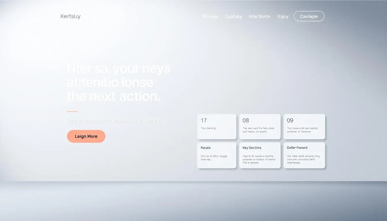
Design patterns that focus attention on the next action
Use spacing and scale so the eye follows a natural path to the CTA. Structure the page so headings, key text, and the primary button form a clear visual line. This reduces hesitation and nudges visitors toward the next action.
Visual hierarchy, whitespace, and scannable text
Prioritize clear headings and short paragraphs. Bold headlines and concise subheads let users scan and find important information fast.
Use ample whitespace to separate elements and to make the CTA pop. Contrast, size, and placement tell the eye where to go first.
Keep body text short and benefit-led so readers get value without digging through dense blocks of information.
Form friction reduction and placement above the fold
Place the primary form above the fold when intent is high. A visible form reduces clicks and shows the action is simple.
Minimize fields, label required inputs clearly, and add helper text for complex items. Real-time validation cuts errors and boosts completion.
Differentiate primary and secondary buttons with size and color so users know which action to take next. Test variations to find the page best balance between information and simplicity.
Standout examples of interactive landing pages
Real-world pages show practical ways to marry creativity with clear conversion paths.
Wise uses an on-page calculator to show fees in real time. That clarity lowers hesitation and speeds decision-making. A click-to-play video sits beside the calculator to demo setup and transfer flow quickly. Together they push visitors to a single CTA: start a transfer.
Landbot and conversational qualification
Landbot embeds a chat module that previews the product experience and qualifies leads before a form appears.
Creative showcases: Adobe x Bowie & Publicis Norway
Adobe x Bowie offers an immersive canvas that delights users and keeps attention high. Publicis Norway uses scroll-speed typography for an instant, memorable hook.
MagicUI-driven examples: Langfuse & Cognosys
Langfuse features an animated header and shimmering buttons built with MagicUI. Cognosys delivers motion-rich interfaces that signal innovation. Both keep a 1:1 attention ratio and end with a clear CTA.
“These pages balance creativity with claritydelight first, then a simple next step.”
| Example | Key element | Conversion trigger |
|---|---|---|
| Wise | Calculator + video | Transparent fees Start transfer CTA |
| Landbot | Chat module | Preview product Qualify Form |
| Adobe x Bowie | Interactive canvas | Engage Explore CTA |
| Cognosys / Langfuse | Animated UI (MagicUI) | Attention Trust Sign-up |
Takeaway: borrow the patterns that fit your offeruse real tools that reduce doubt and guide users to one clear next step.
How to create landing page experiences step-by-step
Start every build by naming one measurable outcome and the visitor behavior that proves it. This keeps the team focused on conversion and prevents feature creep.
Define a single goal and audience intent
Pick one clear goalsignup, demo, or downloadand tie it to a target audience. Match headline text and hero media to that intent so visitors see the promised value immediately.
Choose a template, map content, and wireframe interactions
Select a proven template or AI-assisted builder that encodes the right structure for your offer. Map the message flow from headline to CTA, place the form where intent is highest, and wireframe where each interaction lives.
Build, test performance, and launch with tracking
Optimize media and scripts for speed, set responsive breakpoints, and add semantic markup for accessibility. Launch with UTM tags, events, and analytics in place.
Test methodically: A/B headlines, hero media, layout, and CTA copy in sequence. Use heat maps and session recordings to spot friction, then iterate weekly during the first month.
For a practical walkthrough on how to create landing page structure and best practices, see create landing page.
Common mistakes that kill conversions and how to avoid them
Too much on a single screen scrambles priorities and sends visitors away. When a landing page piles on details, visitors lose the path to the form or CTA. Trim copy to the essentials and keep only elements that push toward the single goal.
Overloading information, weak CTAs, and poor design
Long blocks of text, multiple CTAs, and dated visuals reduce trust quickly.
Fixes: shorten headlines, use benefit-led CTA text, and upgrade imagery so the page looks current. Reduce form fields to what you truly need and explain what happens after submission.
Lack of social proof and inconsistent messaging
Missing or buried proof causes hesitation. Off-message copy breaks ad-to-page congruence and spikes bounce rates.
Fixes: place testimonials near decision points, show logos or metrics, and match ad headlines to the first screen. Keep messaging precise so visitors feel the promise was fulfilled.
- Remove excess links that leak attention away from your CTA.
- Use motion sparinglyonly to clarify, not to distract.
- Test changes with A/B experiments instead of guessing.
- Review accessibility and mobile UX to prevent silent conversion killers.
“Small removals often lift conversions faster than big redesigns.”
interactive guide landing pages: metrics that matter right now
Measure what matters first: pick the single KPI that proves your page moves people to take action. Use that metric to prioritize tests and fix the biggest blockers fast.
Conversion rate is the primary KPI. Set channel-specific benchmarks so you know if a paid search visit converts like organic traffic or remarketing.
Conversion rate, bounce rate, engagement time
Watch bounce rate to spot message mismatch or load issues. Pair that with engagement time to judge whether the page holds visitors long enough to interact.
Form completion rate and quality of leads
Track form completion rate to find friction in fields or steps. Then measure downstream qualityMQLs, SQLs, and revenueto ensure higher conversions mean better leads.
- Segment metrics by source to scale winning channels.
- Tie pages to campaigns for clean attribution and revenue tracking.
- Use heat maps & session replays to add qualitative context to numbers.
- Review regularly and share dashboards so teams act on the same signals.
| Metric | What it shows | Action |
|---|---|---|
| Conversion rate | Goal completions per visit | A/B test headline, CTA, or form |
| Bounce rate | Immediate drop-offs | Fix messaging mismatch or speed |
| Engagement time | Content resonance | Improve media, interactions, or copy |
| Form completion rate | Friction in the form | Reduce fields; add progressive profiling |
| Lead quality | Downstream conversion to MQL/SQL | Adjust targeting and qualification |
Conclusion
Focus every screen on one measurable result and you turn visits into predictable outcomes.
Single-focus design is the backbone of an effective landing page. Small, purposeful interactions clarify benefits and help visitors choose faster.
Prioritize speed, responsiveness, and accessibility so the experience works for everyone. Back claims with social proof to lower perceived risk and build trust.
Align messaging with ads, email, and brand to keep momentum. Use templates and tools to ship faster, then test continuously to raise performance.
Start simple: pick one page, add one small interaction, run one test. When expectations match outcome, better experiences deliver real results for your company.
FAQ
What makes an interactive guide landing page more effective at driving conversions?
A focused design that removes distractions, aligns the headline, hero, and CTA to a single goal, and uses interactive elements like quizzes or calculators keeps visitors engaged. This clarity boosts trust and guides users to take action, improving conversion rate and lead quality.
Which page types benefit most from adding interactivity?
Squeeze and lead-capture pages, click-through and long-form pages, and video-first product or SaaS pages all gain from interactive features. Each type can use tailored toolsforms, demos, or mediato better qualify visitors and increase conversions.
What are the essential elements every high-converting page needs?
Every page should include a clear USP and headline, supporting copy, a strong hero image or video, a prominent CTA, and a smart form strategy. Add social proof, privacy notices, and a thank-you page to build trust and improve follow-up results.
How can interactive techniques like quizzes or micro-interactions improve performance?
Interactive tools increase engagement and time on page, surface user intent, and personalize the experience. Quizzes and calculators qualify leads; animations and micro-interactions clarify steps and reduce friction, which can lower CPC and boost quality scores.
How important is page speed and mobile responsiveness?
Crucial. Fast load times and responsive design directly affect bounce rate, engagement, and conversions. Optimize images, defer unused scripts, and test mobile layouts so visitors move smoothly from attention to action.
What should I A/B test first when optimizing a landing page?
Start with headline variations, CTA copy and placement, hero media (image vs. video), and form length. Use heat maps and recordings to find behavior patterns, then test layout and microcopy to refine performance.
Which analytics and tools help track page effectiveness?
Use analytics platforms for conversion tracking, heat-mapping tools for behavior insights, and session recordings to spot drop-off points. Tools like HubSpot landing pages and MagicUI components speed up building and testing while keeping campaign alignment.
How do I align a page with ads and email for better results?
Match messaging, visuals, and the offer across ads, email, and the page to create consistency and trust. Use UTM tracking, dedicated landing templates for each campaign, and smart content to personalize the experience for audiences.
What role does social proof play in boosting conversions?
Social proof like testimonials, case studies, and proof points reduces buyer risk and builds credibility. Place persuasive proof near the CTA and on thank-you pages to increase confidence and upsell opportunities.
What common mistakes reduce conversion rates and how do I avoid them?
Avoid overloading pages with information, weak or multiple CTAs, slow loading media, and inconsistent messaging. Keep a single-focus design, reduce form friction, and add clear social proof to maintain attention and drive action.
How can I measure the quality of leads from my page?
Track conversion rate, form completion rate, engagement time, bounce rate, and downstream metrics like sales-qualified leads. Use UTM parameters and CRM integration to assess lead quality and campaign ROI.
Are there ready-made templates or components to speed up building these pages?
Yesmany platforms offer templates and UI kits. HubSpot provides landing pages, smart content, and themes, while component libraries like MagicUI help add interactive modules quickly without heavy dev time.