Integrate gamification into broader content experience design strategies.
Complement gamification with chatbot lead generation funnels for higher conversions.
Surprising fact: companies that tweak form UX can lift conversions by up to 40%—yet many still treat forms as a dull afterthought.
Smart, playful design changes that. Multi-step “wizard” patterns show one question at a time and add progress bars to reduce overwhelm. That single choice can make users feel momentum and finish faster.
Branding counts too. Readable fonts, clear color contrast, and on-brand visuals improve clarity and trust. Add familiar game elements—progress bars, badges, streaks, or points—and you give instant feedback that keeps people moving.
The goal is simple: create an experience that respects users’ time, boosts engagement, and ties to real marketing and business metrics like conversion lift and retention.
Key Takeaways
- Well-designed, multi-step patterns reduce friction and increase completion.
- Progress bars and micro-rewards give users clear momentum.
- Readable fonts and accessible colors boost trust and conversions.
- Place forms where users focus and use a single CTA to cut choices.
- Measure impact with engagement depth, conversion lift, and retention.
Why Gamified Content Entry Forms Matter for User Experience and Conversion
Users in the U.S. arrive ready to engage, yet clarity and speed decide whether they complete an action.
User experience hinges on removing friction: long, redundant fields and jargon kill momentum. Strip questions to essentials so people give only the information needed. That alone raises participation and cuts abandonment.
Multi-step wizard flows mirror conversation. They break a task into bite-sized steps, reduce cognitive load, and increase perceived ease. When each step feels fast, engagement climbs and conversion rates follow.
User intent in the United States: participation, speed, and clarity
American users expect quick wins. Place high-intent forms near the top of landing pages. For blog-driven lead gen, situate calls deeper where context primes action. Clear CTAs and strong color contrast respect diverse users and guide action.
From “nice design” to revenue: forms as the gateway to growth
Thoughtful design turns a passive element into a conversion engine. Use instant feedback—correct/incorrect prompts or conditional quiz logic—to sustain motivation and progress. Follow submissions with thank-you pages that confirm success and point to the next best action.
- Remove jargon and redundant fields to speed completion.
- Use progressive steps and feedback to boost engagement.
- Measure engagement depth and conversion lift to validate investment in gamification.
For a deeper look at how playful mechanics can increase conversion, see this conversion study.
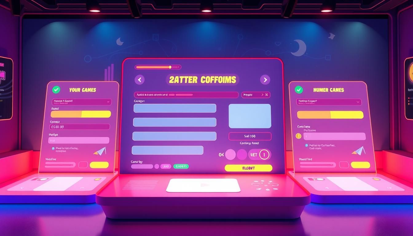
Core Game Mechanics You Can Add to Forms Right Now
Adding a few lightweight mechanics makes progress feel real and worth tracking. Start small: visible rewards and clear steps change perception and reduce abandonment.
!game mechanics
Points, badges, and streaks to reward progress
Points or coins give users immediate, measurable gains. Badges mark milestones and streaks encourage return visits. Together they create a loop that nudges completion without heavy redesign.
Leaderboards and friendly competition
Offer optional leaderboards for teams or campaigns where competition helps. Keep it opt-in so users who prefer private progress are not discouraged.
Progress bars, levels, and performance charts
Progress indicators and level meters reduce uncertainty. Use simple charts or a meter like LinkedIn’s profile strength to leverage the Zeigarnik effect and keep users engaged.
Time-boxed challenges and small in-form games
Short challenges, spin-to-win reveals, or minute-long quests work well for promotions. They add surprise without derailing the main task.
Instant feedback, micro-rewards, and surprise elements
Use conditional logic for instant feedback on quiz-style questions. Add confetti, small perks, or occasional surprises to reward milestones and sustain engagement.
- Tip: Match mechanics to the goal — subtle progress cues for lead capture, playful elements for surveys.
- Tip: Most modern builders support points and badges without an app overhaul.
- Tip: Align each mechanic with a clear user outcome so engagement drives action.
Make Forms Feel Like a Game: Multi-Step Design Done Right
Break long tasks into short, friendly steps to keep attention and reduce drop-off.
When to switch: move from a single-step page to a wizard flow for longer content capture, qualification, or applications. Multi-step layouts work best when questions pile up or when answers determine following logic.
One question per step lowers cognitive load. It feels conversational and reduces errors. Add short hints or microcopy on each screen to clarify intent without clutter.
Use clear progress indicators and named steps so users know where they are and how many remain. Group related fields into logical steps that match a user’s mental model to improve flow.
Design mobile-first. Use thumb-friendly controls, minimal typing, and allow saving partial progress. Let users go back without losing momentum.
Keep visual energy low and helpful: subtle GIFs or tiny illustrations can lift engagement while maintaining focus on completion. Track step-level drop-offs to find friction and iterate.
| Use Case | When to Use Wizard | Key Element | Metric to Track |
|---|---|---|---|
| Job Application | Yes — many fields | Save progress | Step drop-off rate |
| Lead Capture | When qualifying is needed | Progress bar | Completion rate |
| Survey | Long surveys | One question per screen | Time per step |
| Quick sign-up | No — keep single step | Minimal fields | Time to action |
Design Elements That Keep Users Coming Back
A clean visual system invites repeat visits and reduces drop-offs.
Readable fonts and strong color contrast reduce eye strain. They make fields easier to scan on phones and desktops. This simple step improves comprehension for all users.
On-brand styling ties the experience to your site. Use consistent headers, button shapes, and a limited palette so the form feels like a natural part of the page.
!design elements
Microcopy, GIFs, and supportive hints
Write short, conversational microcopy that explains why you ask for details. Replace “Submit” with outcome-driven labels like “Get my recommendations”.
Sprinkle tasteful GIFs or small media icons to add warmth and a bit of fun without distracting from completion. Provide inline examples and real-time validation to cut errors and rework.
| Element | Why it matters | Quick tip |
|---|---|---|
| Font & Contrast | Improves legibility for diverse audiences | Use 16px+ base font and AA contrast |
| Microcopy | Reduces anxiety and clarifies requests | Keep lines under 10 words |
| Media (GIFs/icons) | Adds personality without clutter | Limit to one per step |
| Real-time validation | Prevents frustration at submit | Show inline, friendly messages |
Finally, add a short privacy note near sensitive fields. That small trust cue increases confidence and long-term engagement with your audience.
Placement, Navigation, and On-Page Cues That Boost Engagement
Placement of your signup area often decides whether a visitor converts or leaves.
Map placement to intent. Put the main form at the top for landing or offer pages where visitors arrive ready to act. For blog-led lead gen, place the prompt three-quarters down or at the end where context primes conversion.
Use directional cues to guide attention. Arrows, gaze lines in imagery, and split layouts (video left, form right) naturally steer users toward the action without shouting.
Keep the page scannable. Reduce competing links and keep a single CTA so people know the exact next step. Add nearby trust signals—testimonials, partner logos, or short privacy notes—to strengthen confidence at the moment of decision.
Optimize load performance and ensure sticky navigation doesn’t obscure the primary CTA. After submission, route users to a clear thank-you page with next steps like calendar booking, downloads, or related articles.
Quick reference
| Use case | Recommended placement | Key cue |
|---|---|---|
| Landing page | Top of page | Single CTA, strong contrast |
| Blog post | 3/4 down or end | Contextual CTA, testimonial |
| Lead gen | Spotlight area / split layout | Directional arrow or gaze |
- Test variants of placement and cues to find the best way for your audience.
- Align page copy and microcopy so the experience feels cohesive and fast.
Gamified Content Entry Forms: A List of High-Impact Tactics
A few targeted tactics will lift completion rates without bloating your page or backend. Use mechanics that guide decisions, reward progress, and deliver instant feedback so users stay engaged and finish the task.
!use gamification
Quiz-style branching with conditional logic
Use conditional logic to route questions and show right/wrong feedback instantly. This makes quizzes feel conversational and helps users correct mistakes fast.
Tiered rewards and in-form currencies
Introduce points or small currencies to mark milestones. Think Duolingo coins or Starbucks stars—these elements encourage users to return and complete longer sequences.
Spin-to-win, mystery boxes, and AR lite
Add short surprise mechanics—spin wheels, mystery boxes, or lightweight AR overlays—to create curiosity spikes. Keep them optional and fast so they delight rather than distract.
Personalized challenges based on behavior
Tailor tasks by segment and past actions. Personalized goals feel relevant and reduce friction, which increases the chance a user will take the next action.
Thank-you pages as the final “level”
Treat the completion screen like a final level. Unlock incentives—discounts, bonus content, or next-step CTAs—to convert the moment of success into continued engagement.
- Tip: Add light social proof or a subtle competition cue (e.g., “X peers completed this in 2 minutes”).
- Tip: Cap mechanics—pick 1–2 that match your goal and audience to avoid overload.
- Tip: Test performance for any rich media and offer an alternative path for risk-averse users.
Borrowed From Winners: Examples Reimagined for Forms
Successful services give repeatable elements that make tasks feel rewarding and fast.
Duolingo-inspired streaks translate to daily goals and retry tokens. Offer a small safety net—hearts or retries—so users try again without fear. This reduces abandonment and builds habit.
Fitbit-style badges celebrate milestones like a 100% profile or multi-step completion. Badges act as visible proof of progress and motivate repeat participation.
LinkedIn-like completion meters
Show a clear progress meter that lists missing steps. Users see what’s left and how each action improves their profile or application strength.
Starbucks-style stars and tiers
Reward repeat submissions with points or stars that unlock tiers. Tie perks to real value so incentives feel meaningful to your audience.
“Small, meaningful rewards convert one-time visitors into returning users.”
- Translate streaks to daily goals and hearts as retry tokens.
- Issue milestone badges for big wins like profile completion.
- Use a progress meter to make progress visible and actionable.
- Implement stars and tiered rewards for repeat participation.
- Show light competition benchmarks for social proof.
| Winner | Pattern | Form Use | Benefit |
|---|---|---|---|
| Duolingo | Streaks & hearts | Daily goals, retry tokens | Increases habit and reduces fear of mistakes |
| Fitbit | Milestone badges | Badges for milestones | Boosts pride and repeat participation |
| Completion meter | Profile strength / step list | Improves clarity and completion rate | |
| Starbucks | Stars & tiers | Points for repeat actions | Encourages loyalty and return visits |
Use examples from winners carefully: match elements to your audience and avoid overdoing novelty. Combine progress cues with useful tips so users learn while they advance.
Psychology of Gamification in Form UX
Human attention bends toward unfinished tasks and small, achievable wins. That simple tendency makes progress meters and partial completion powerful hooks that nudge people to finish what they start.
Curiosity, mastery, and the Zeigarnik effect
The Zeigarnik effect creates tension when a task is incomplete. Progress bars, saved drafts, and visible steps exploit that tension in a friendly way. Curiosity drives users to explore and return to see the next bit.
Intrinsic vs. extrinsic rewards and habit loops
Intrinsic rewards like mastery and competence build deep motivation. Extrinsic rewards, such as points or badges, speed early engagement and make the experience feel fun.
Streaks and daily goals form habit loops. Small wins each day increase return rate and long-term engagement. Keep streaks optional to avoid pressure.
| Type | Example | Benefit |
|---|---|---|
| Intrinsic | Progress meter | Sense of mastery |
| Extrinsic | Points / badges | Immediate reward |
| Behavioral | Streaks | Habit formation |
- Use just-in-time encouragement and micro-rewards that feel fun without pressure.
- Offer leaderboards or social features as opt-in to protect privacy and avoid unhealthy competition.
- Frame tasks as short, achievable steps to lower anxiety and raise perceived control.
Provide immediate feedback so users learn and feel progress. Be transparent about rewards and odds to keep trust high with your audience. Test different motivational mixes to match diverse segments and measure user engagement over time.
Tools, Stack, and Design Workflow to Use Gamification
Combine a flexible builder and analytics so every experiment feeds the next decision. Start with an app-friendly form builder that supports multi-step wizards, conditional logic, inline media like GIFs, and built-in progress bars.
Pick a platform that lets designers add media and rewards without heavy engineering. Ensure save-and-resume and step-level validation are native features for longer processes.
Add analytics, A/B testing, and personalization
Layer analytics to measure completion, step drop-off, DAU/MAU, and time to first key action. Run A/B tests on microcopy, feedback style, and reward mechanics to see what raises user engagement.
Use personalization tools to tailor hints, challenges, and incentives by segment or past behavior. Tie dashboards to business metrics so stakeholders see how experiments affect revenue and retention.
Suggested workflow and vendor categories
- Prototype in a visual builder, run a quick usability test, then launch a limited test in your app.
- Analyze funnels, heatmaps, and cohorts; iterate on the most leaky steps.
- Document UI patterns—controls, feedback, rewards—so design stays consistent as you scale.
- Consider category leaders for gamification and loyalty: Centrical, Spinify, Rallyware, Smile.io, LoyaltyLion, Workhuman, SalesScreen, and microlearning tools like Axonify.
| Layer | What to check | Example metric |
|---|---|---|
| Builder | Multi-step, media, logic | Step completion rate |
| Analytics | Funnels, cohorts, DAU/MAU | Retention by cohort |
| Personalization | Segmented rewards | Conversion lift |
Security and privacy must be part of the process. Limit sensitive information, log consent, and share results via dashboards that connect engagement to business outcomes.
Measure What Matters: Engagement, Conversion, and ROI
Start measuring with simple, outcome-focused metrics so teams know what to optimize next.
Engagement depth should combine session duration, interactions per visit, and completion rate. Track whether users move beyond passive page views and take measurable action.
Conversion lift is best shown by A/B tests that compare gamification flows with static controls. Report conversion rates for each CTA and track reduced time to first key action to prove faster activation.
Retention, referrals, and progress analytics
Monitor DAU/MAU, streak adherence, and cohort retention curves to judge stickiness. Use share incentives to measure referral volume and share-driven traffic.
Step-level progress analytics reveal where users drop off. Prioritize fixes that move the needle on completion and give the best ROI.
Tie metrics to business outcomes
Map results to qualified pipeline, revenue per lead, and customer lifetime value. Dashboards should translate app and web data into clear decisions for product and marketing teams.
“Measure what moves the needle — not every metric you can collect.”
- Define engagement depth: session duration, interactions, completion.
- Quantify conversion lift and track TTFKA to reduce early churn.
- Review retention, referrals, and cohort CLV quarterly and keep testing.
Conclusion
Small design shifts often create the biggest gains in user completion and satisfaction. Add simple elements—progress bars, micro-rewards, and instant feedback—to make tasks clearer and more motivating. These game mechanics and gamification cues lift engagement and help users finish faster.
Place the signup or app step the right way on the page, use a single CTA, and guide attention with directional cues. Borrow proven patterns from Duolingo, Fitbit, LinkedIn, and Starbucks, then adapt them to your audience and goals.
Measure what matters: track engagement, conversion, retention, referrals, TTFKA, and CLV. Start with one pilot, learn quickly, and scale ethically so users keep coming back. Implement one high-impact tactic this quarter and let data drive the next move.
FAQ
What are the benefits of adding game-like elements to online forms?
Adding game-like elements increases engagement, reduces abandonment, and can boost conversion rates. Elements such as points, progress bars, and instant feedback make tasks feel shorter and more rewarding, which helps users complete forms and return to the app or site.
Which core mechanics work best for improving user experience?
Use points, badges, streaks, and clear progress indicators. Combine those with leaderboards for friendly competition, micro-rewards for small wins, and timed challenges to create urgency. These mechanics encourage participation and make the process feel more like a light game than a chore.
How do multi-step, wizard-style flows improve completion?
Multi-step flows reduce cognitive load by breaking tasks into one-question-per-step pieces. Clear step labels and progress indicators give users a sense of momentum and mastery, which raises completion rates and lowers drop-offs.
What design elements keep users coming back to forms and apps?
Readable fonts, accessible color palettes, branded visuals, and conversational microcopy. Add supportive hints, GIFs, and subtle animations to make interactions pleasant. Consistency and clarity are key for retention and repeat participation.
Where should you place interactive forms on a site for best results?
Position lead-generation forms on landing pages, inline forms on blog posts where context matters, and compact sign-up widgets in headers or footers for general discovery. Use directional cues like arrows and gaze, and keep a single CTA focus to guide action.
Can rewards and tiers really increase lifetime value (CLV)?
Yes. Tiered rewards, in-form currencies, and milestone badges encourage repeat behavior and higher-value actions. Over time, these tactics lift retention metrics, increase referral volume, and can drive higher CLV through sustained engagement.
How do you personalize challenges and rewards for different users?
Use behavior-based segments and simple analytics to tailor difficulty, rewards, and messaging. Personalized quests or conditional branching deliver relevance, boost perceived value, and improve conversion across user cohorts.
What quick tactics can be implemented without heavy engineering?
Add progress bars, simple badges, and instant feedback messages. Use quiz-style branching with conditional logic available in many form builders. A/B test visuals and microcopy to measure effect before investing in advanced features.
Which analytics and metrics should teams track first?
Start with engagement depth (session time, interactions), completion rate, and conversion lift for CTAs. Track retention (DAU/MAU and streak adherence), time to first key action, and referral volume to tie efforts back to ROI and cohort performance.
Are surprise elements and micro-rewards effective or gimmicky?
When used sparingly and with purpose, surprise elements like mystery boxes or spin-to-win moments boost delight and encourage repeat visits. Pair them with meaningful progress mechanics to avoid undermining intrinsic motivation.
What accessibility and UX rules should designers follow when adding game elements?
Ensure readable fonts, sufficient color contrast, keyboard navigation, and clear labels. Keep interactions simple, provide alternative text for media, and avoid time limits that exclude users who need more time.
Which third-party tools help build interactive, game-like flows?
Look for form builders and platforms that offer multi-step flows, conditional logic, media support, and built-in analytics. Add A/B testing and personalization layers to refine experiences and measure impact.
How do examples from real products translate to forms?
Borrow ideas like Duolingo streaks for daily submissions, Fitbit-style badges for milestones, LinkedIn completion meters for profile progress, and Starbucks-style tiers for repeat participation. Adapt these mechanics to the form context to guide behavior and reward progress.